BLUE PAINTING
Eunjeong Kim, Miyoung Kim, MinKim, Yujin Ju
April 21 - May 20, 2023
Catalogue / Press Release
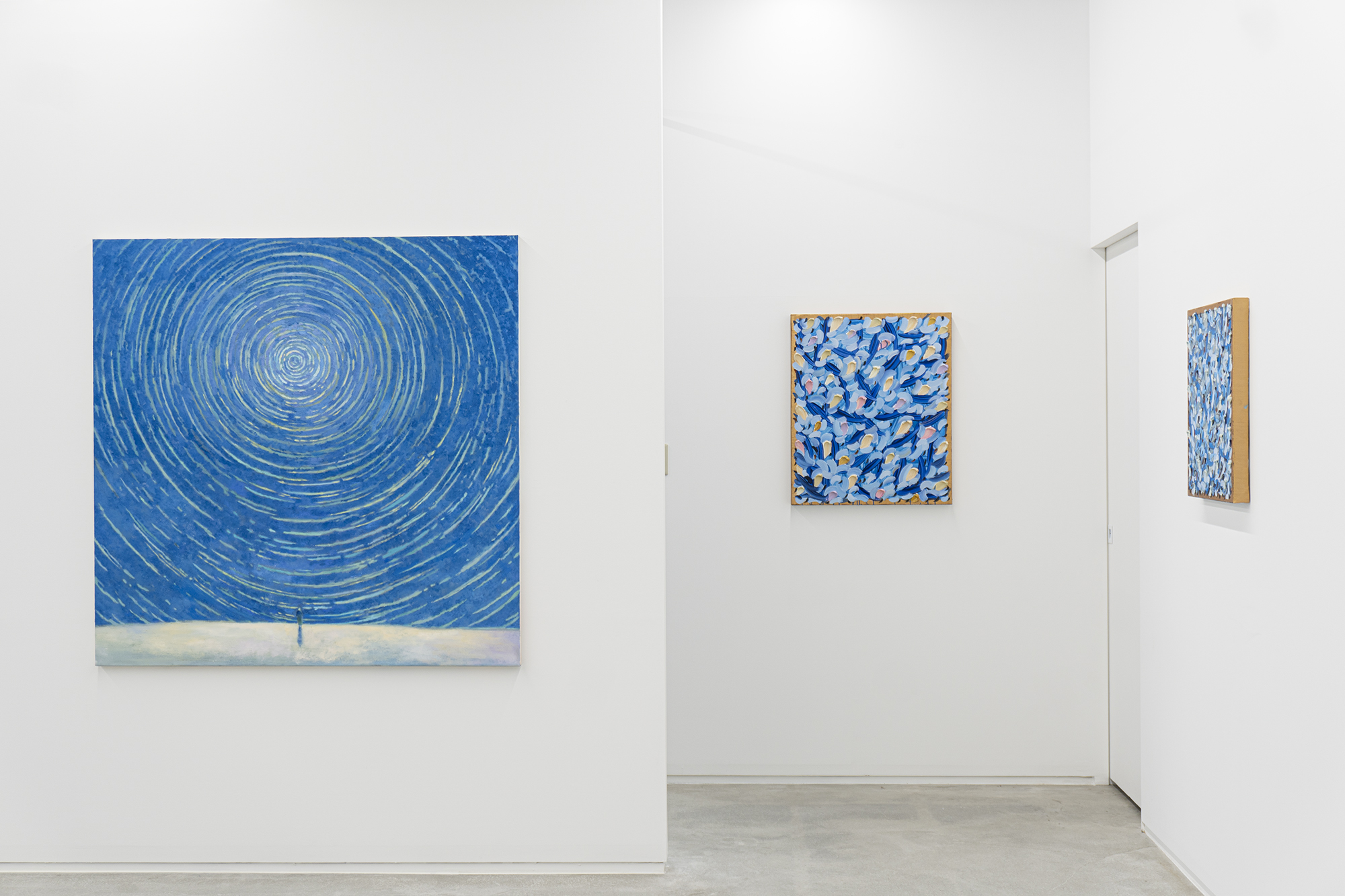
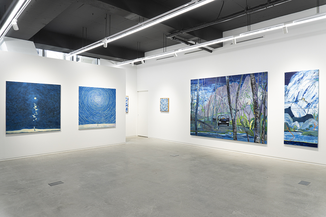
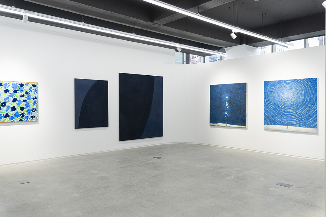
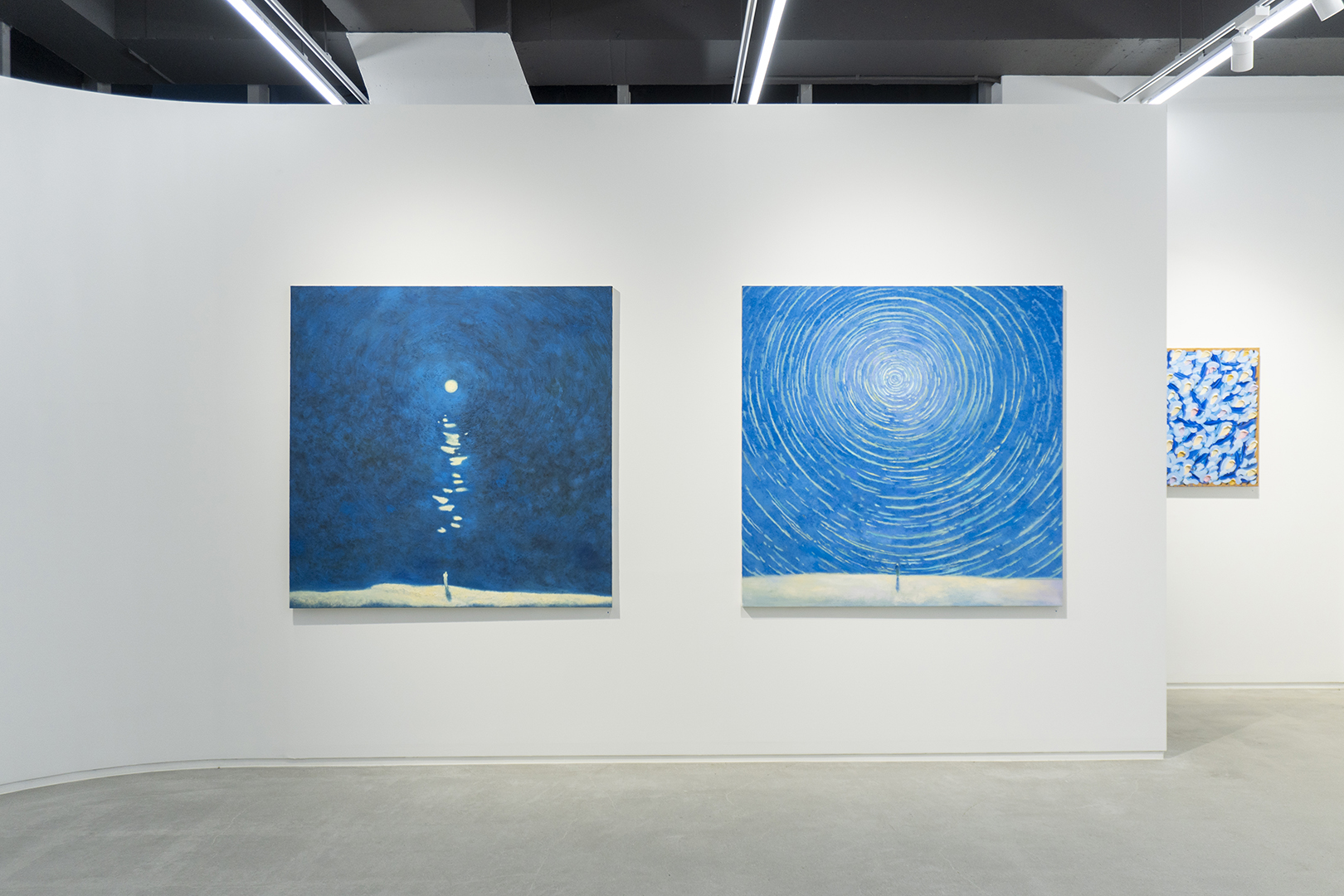
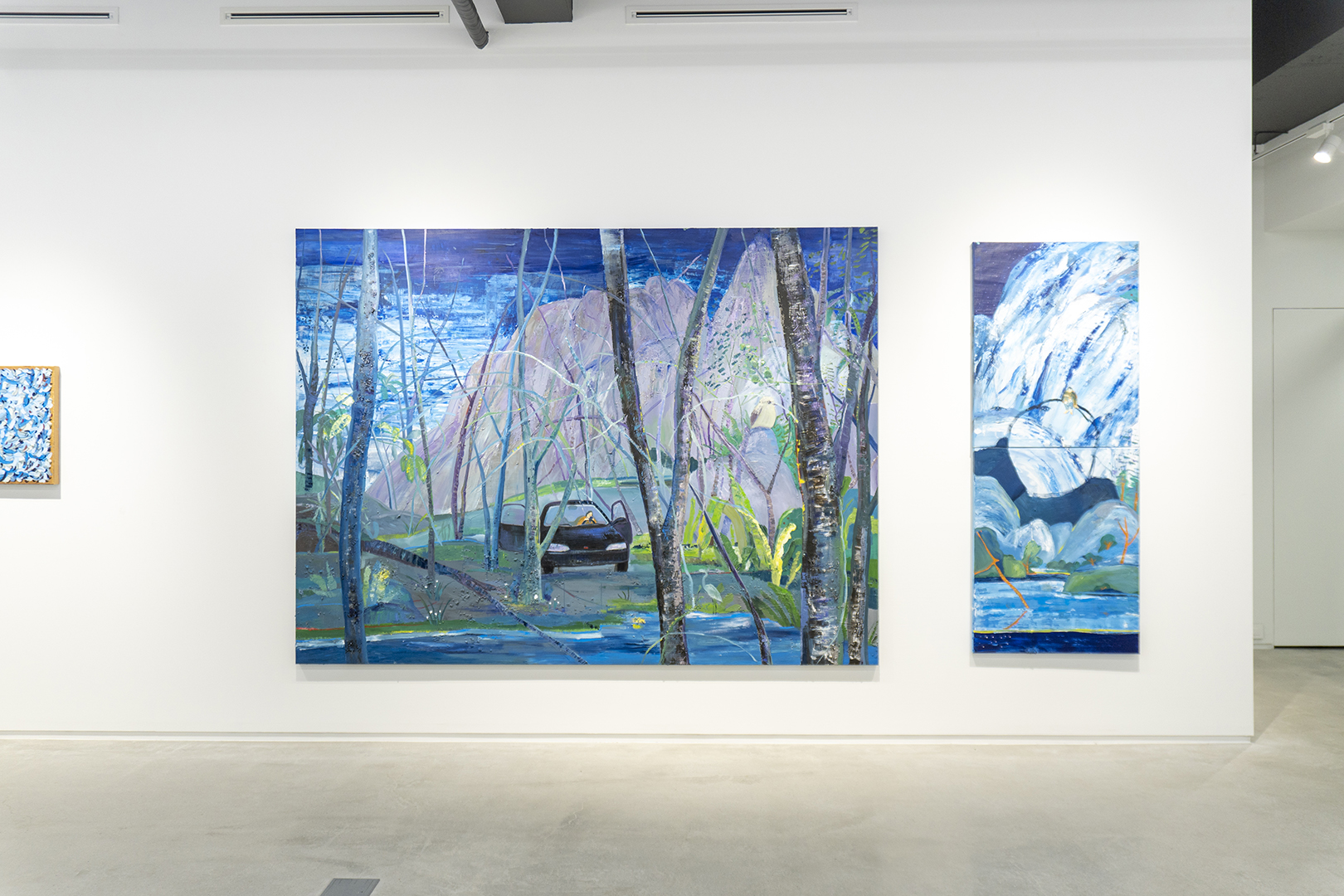
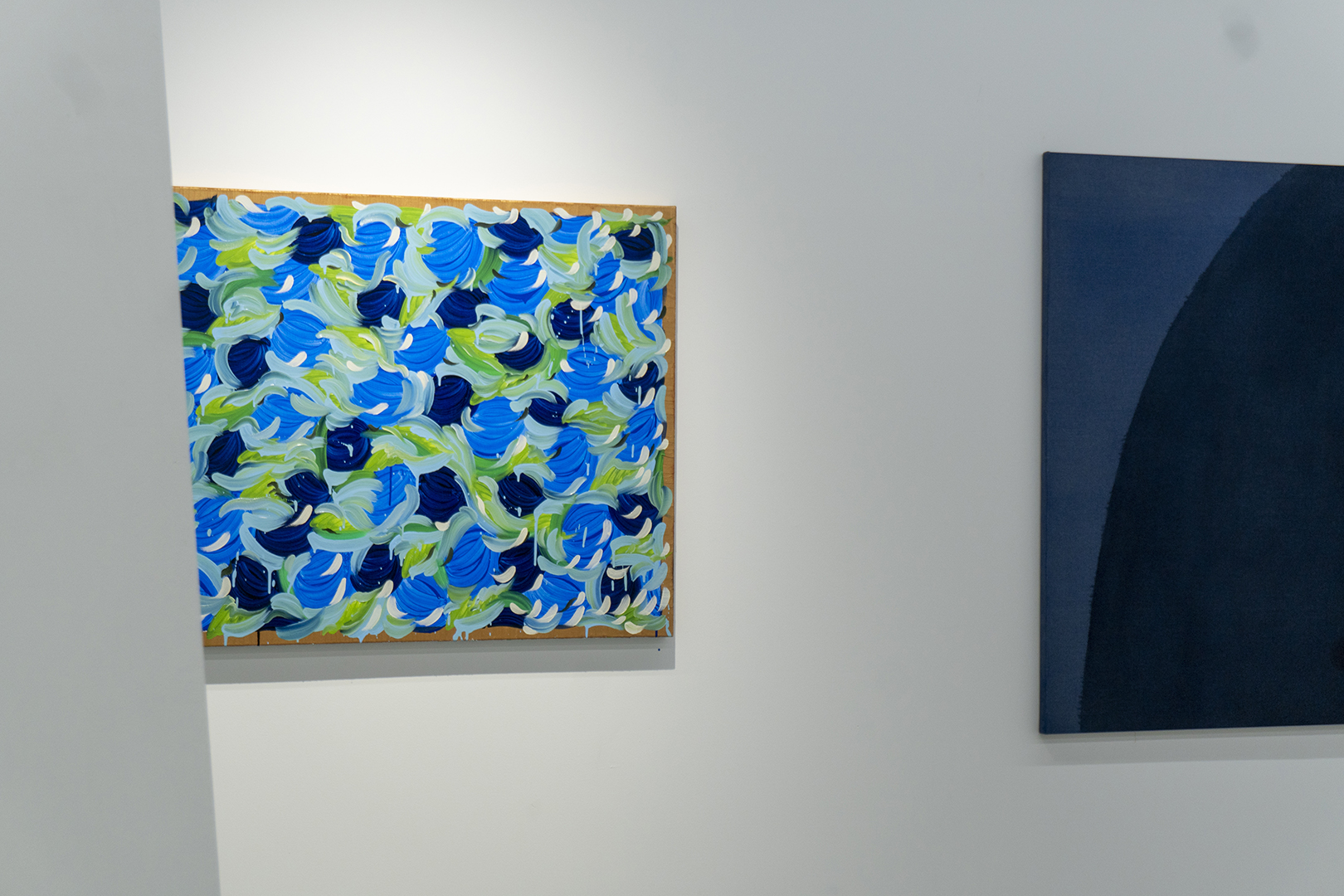
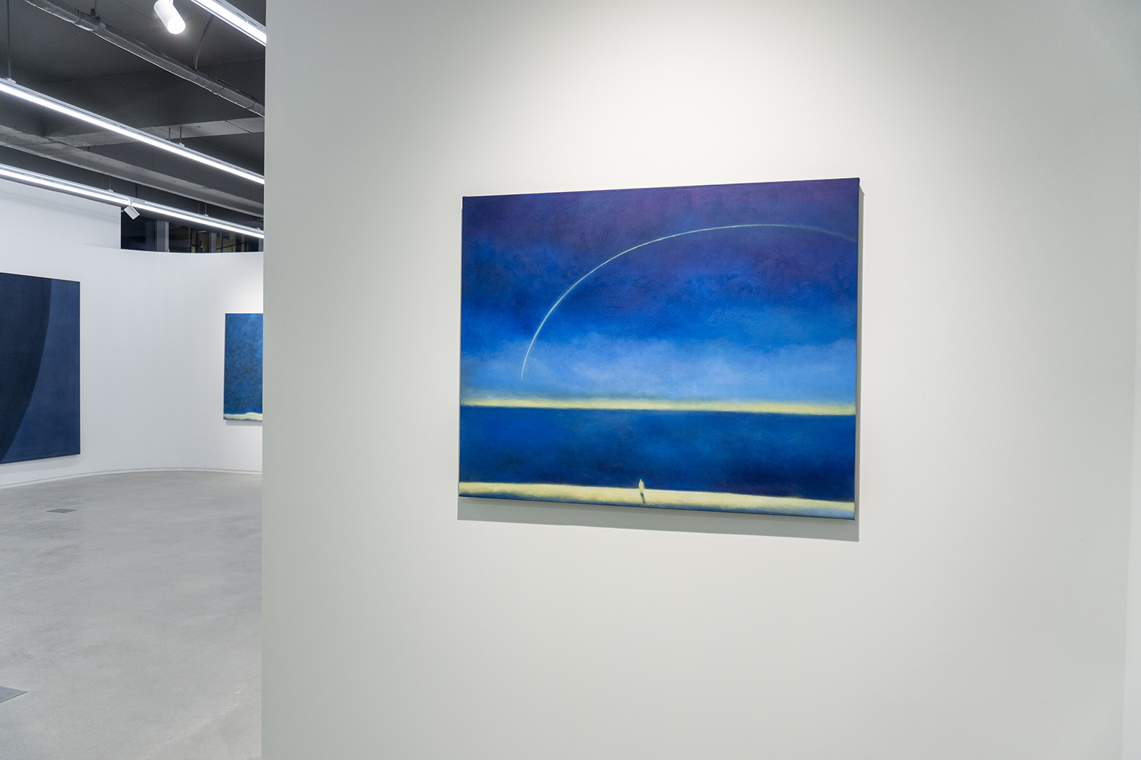
CDA proudly presents the exhibition <BLUE PAINTING(블루 페인팅)>, featuring four contemporary artists' diverse interpretations, expressions, and imaginations of the color blue. The word 'blue' cannot be limited to simply referring to the optical color blue, as its spectrum is too broad and its depth is immeasurable. It symbolizes situations, and human emotions. Additionally, the color blue has a profound value in art history, such as in Picasso's blue period or the blue rider movement founded by Kandinsky. Through this exhibition, CDA intends to explore how four different painters – Meeyoung Kim, Eunjeong Kim, MinKim, and Yujin Ju – interpret and express blue in their respective artistic worlds. It is hoped that viewers will discover new emotions and perspectives towards blue and experience the various aspects of blue that it holds, which may have gone unnoticed in their daily lives.
Eunjeong Kim, Miyoung Kim, MinKim, Yujin Ju
April 21 - May 20, 2023
Catalogue / Press Release
CDA proudly presents the exhibition <BLUE PAINTING(블루 페인팅)>, featuring four contemporary artists' diverse interpretations, expressions, and imaginations of the color blue. The word 'blue' cannot be limited to simply referring to the optical color blue, as its spectrum is too broad and its depth is immeasurable. It symbolizes situations, and human emotions. Additionally, the color blue has a profound value in art history, such as in Picasso's blue period or the blue rider movement founded by Kandinsky. Through this exhibition, CDA intends to explore how four different painters – Meeyoung Kim, Eunjeong Kim, MinKim, and Yujin Ju – interpret and express blue in their respective artistic worlds. It is hoped that viewers will discover new emotions and perspectives towards blue and experience the various aspects of blue that it holds, which may have gone unnoticed in their daily lives.
블루 페인팅
김은정, 김미영, 민킴, 주유진
2023년 4월 21일 - 5월 20일
카탈로그 / 보도자료
씨디에이는 ‘블루(Blue)’를 향한 동시대 회화 작가들의 다채로운 해석과 표현, 그리고 심상을 담기 위한 전시 《블루페인팅》을선보인다. 블루는 단순히 푸른색을 의미하는 단어로 한정하기에는 그 스펙트럼이 너무 넓고, 깊이 또한 무척 깊다. 블루는 인간의 감정을 형용하며 상황을 상징한다. 또한, 피카소의 ‘청색시대(Blue Period)’ 나 칸딘스키가 창시한 추상표현주의 ‘청기사파(The Blue Rider)’와 같이 미술사적 흐름안에서도 ‘블루’의 가치는 남다르다. 씨디에이는 이러한 블루를 중심으로 네 명의 회화 작가, 김미영, 김은정, 민킴, 주유진이 각각 자신의 작업 세계 안에서 이것을 어떻게 해석하고 표현하는지를 살펴보고자 한다. 이를 통해 관객은 평소에 느끼지 못했던 블루를 향한 새로운 감정과 시각을 발견하고, 블루가 가진 다양한 면모를 새로이 경험할 수 있기를 희망한다.
김은정, 김미영, 민킴, 주유진
2023년 4월 21일 - 5월 20일
카탈로그 / 보도자료
씨디에이는 ‘블루(Blue)’를 향한 동시대 회화 작가들의 다채로운 해석과 표현, 그리고 심상을 담기 위한 전시 《블루페인팅》을
Prologue Exhibiton
Meeyoung Kim
If I had to live in one of the world's colors, I would probably choose blue.
There is a very delicate side to blue. There are only a few shades of blue, such as cerulean, cobalt, ultramarine, and Prussian, but the moods that each blue gives off are so varied. The process of deciding to pull the right blue onto the screen is a careful one, like pulling a piece of pottery made of extremely thin and light glass out of a cupboard high above my head.
When the right blue lands on the screen, I'm thrilled. But if I miss my mark, I clean up the shattered pottery not to cut the fingers , and repeat the process with a trembling heart, this time starting from the manufacture of the glass again. When I finally get the exact blue, I need on the screen, its aura is so solid and elegant that I can stare at it forever.
This exhibition is a love letter to blue, the color I have loved the most throughout my life. I have tried to create a harmonious unity by reviewing the series of my works around the representative element of painting, "color." I have tried to distinguish and express my series of works, which have elements of abstract painting, but sometimes cross the boundary of figurative painting, and in the process of thinking, the image of Mondrian's transition process between representational and abstract painting came to mind, and my four paintings also emphasize transition and change as inspiration.
Blue is my identity and the unknown that I want to discover more about. I hope you can appreciate the contrast between bends and flatness, slow and fast, and also feel the visual refreshment of blue.
Eunjeong Kim
1. A vivid memory. When daily commute was tightening like a tight bra strap-I can't breathe-I thought, I wanted to go to the forest. All the circumstances would align and I would become one of the grasses or one of the trees that sprouted there, quietly sprouting up and watching the years go by.
2. <choice> - to follow gravity (or not) - similar time of day - does it look like it was painted by the same person (or not) - where does completeness come from (or not) - grids and modules - appropriate distance (physical and temporal) from the painting - do you understand (or pretend to)
3. the sun had not yet risen. The sea was indistinguishable from the sky. The sea was indistinguishable from the sky. The sea had only a few folds, like the creases in a cloth. The waves were like a man asleep, unconsciously continuing to breathe, and then exhaling again when he thought he had stopped.
-Virginia Woolf, "The Wave," translated by Heejin Park (Seoul: Sol, 2019), p.9.
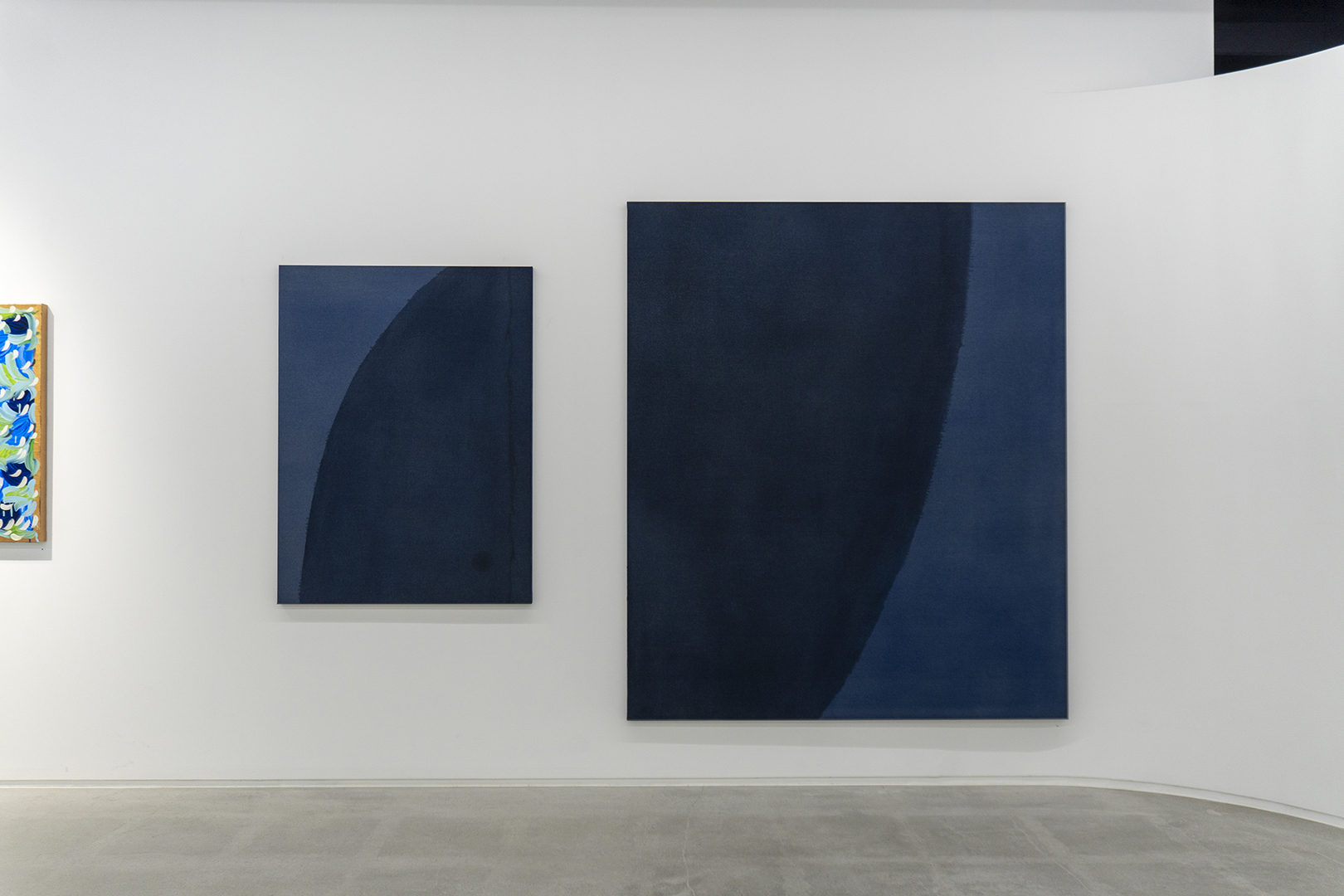
Minkim
Blue is a transcendental, spiritual, spiritual and inner color. The meaning of blue is similar to the nature of abstract art, which expresses the spiritual through physicality or matter, and I think it is one of the most important colors in the history of abstract art.
While my previous work has been geometric and structural, influenced by Kandinsky and Malevich, the early abstract artists of the early 20th century, I am focusing on the process of abstract transformation and material techniques by focusing on the more spiritual and inner aspects of Blue. I think about the meaning of Blue, which Kandinsky hoped for more spiritual things in a materialistic society through the activity of Blue rider, where several artists gathered at the same time, and I think about the meaning of invisible forms of color.
'Blue exists not on the surface but in the depths, not in objects but in the spaces between objects' Blue is a color that is hard to see in nature, and it is only a phenomenon that makes the sky blue and the sea blue, but it is actually a color that exists inside us in an ungraspable form. It is a color that we crave more because it is invisible and ungraspable, as if the universe exists in our minds.
The color 'blue' brought into the canvas is a color that gets darker and deeper as it is layered. Deep blue has a calmness to it. I think about the moment when I feel silent in nature without light and focus inward. You can't see anything in front of you, and shapes slowly move in and out of the moonlight. All your senses come alive in the silence, and then the silence again blocks out the outside world. And I focus inward. I started the work from the point of view of the emotions I felt in the darkness of nature or when I went night diving.
The color dark blue, the more subdued it is, transcends the human and plunges one into endless deep contemplation. Black is the color of the deep, of the inexhaustible, of the unbounded, of the inner world, with a great and deep silence.
I worked with only three colors: Ultra marine, Manganese blue, and Payne's grey. When I thought of the color blue, I thought of deep blue, Yves Klein Blue, or toxic blue, and I was fascinated by the different ways in which the blue color changed during this project. When I applied ultramarine to the linen, it gave off a purplish color, and when I added manganese blue, it gave off a greenish color. Blue has a different appeal as a subtle, natural, relaxing and rich color.
In this work, I kept repeating the process of applying paint to the linen, emptying it out as much as possible, eating it up, and layering it. Through this process, I focused more on the deepening nature of the blue and tried to capture the process of layering on the canvas. The repetitive act of soaking and layering seems to have an oriental feel, as if it were a ritual, and it connects with the western abstraction and orientalism that I have been studying recently.
In this exhibition, I tried to capture the ungraspable form of dark blue in the space between the object and the object in the canvas, such as the blue that is reflected in the materiality of the layers of the brush without any form, such as the blue that is created by the overlapping of the layers of the brush, in the work of <Blue: visible the invisible>.
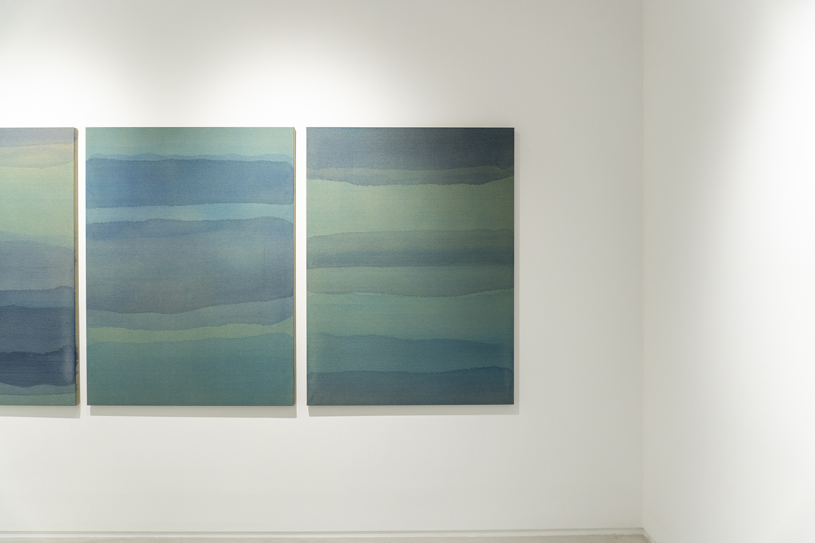
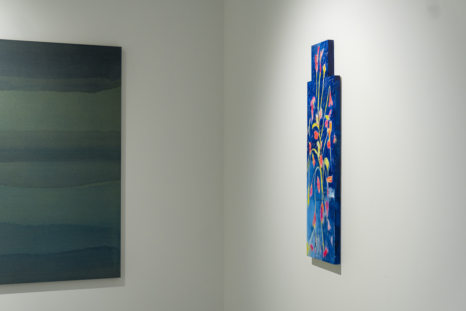
Yujin Ju
Blue as an Intimate Landscape
Perhaps every human being who has ever lived has a unique form of loneliness. As one of the inevitable, even fateful, states of being, solitude appears many times throughout a being's life. I thought that as a being repeatedly visits solitude, it becomes internalized and creates its own unique landscape, a landscape that is not stagnant, a landscape that the being lives in. I imagine the possibilities of that landscape and compose it on canvas.
My solitude has come many times as 'blue'. 'Blue' is a series of landscapes of my own localized solitude, suggesting the possibility of a unique landscape of solitude. When blue is localized within, the elements that make up the landscape become the devices I create to keep me from stagnating in the form of blue solitude. The horizontality of eternal beginnings and endings, the light that adds depth and creates a place to look, and the element of earth for the being to stand on, allow the solitude of the being to have the time of a circulating place rather than the time of a grave.
Meeyoung Kim
If I had to live in one of the world's colors, I would probably choose blue.
There is a very delicate side to blue. There are only a few shades of blue, such as cerulean, cobalt, ultramarine, and Prussian, but the moods that each blue gives off are so varied. The process of deciding to pull the right blue onto the screen is a careful one, like pulling a piece of pottery made of extremely thin and light glass out of a cupboard high above my head.
When the right blue lands on the screen, I'm thrilled. But if I miss my mark, I clean up the shattered pottery not to cut the fingers , and repeat the process with a trembling heart, this time starting from the manufacture of the glass again. When I finally get the exact blue, I need on the screen, its aura is so solid and elegant that I can stare at it forever.
This exhibition is a love letter to blue, the color I have loved the most throughout my life. I have tried to create a harmonious unity by reviewing the series of my works around the representative element of painting, "color." I have tried to distinguish and express my series of works, which have elements of abstract painting, but sometimes cross the boundary of figurative painting, and in the process of thinking, the image of Mondrian's transition process between representational and abstract painting came to mind, and my four paintings also emphasize transition and change as inspiration.
Blue is my identity and the unknown that I want to discover more about. I hope you can appreciate the contrast between bends and flatness, slow and fast, and also feel the visual refreshment of blue.
Eunjeong Kim
1. A vivid memory. When daily commute was tightening like a tight bra strap-I can't breathe-I thought, I wanted to go to the forest. All the circumstances would align and I would become one of the grasses or one of the trees that sprouted there, quietly sprouting up and watching the years go by.
2. <choice> - to follow gravity (or not) - similar time of day - does it look like it was painted by the same person (or not) - where does completeness come from (or not) - grids and modules - appropriate distance (physical and temporal) from the painting - do you understand (or pretend to)
3. the sun had not yet risen. The sea was indistinguishable from the sky. The sea was indistinguishable from the sky. The sea had only a few folds, like the creases in a cloth. The waves were like a man asleep, unconsciously continuing to breathe, and then exhaling again when he thought he had stopped.
-Virginia Woolf, "The Wave," translated by Heejin Park (Seoul: Sol, 2019), p.9.
Minkim
Blue is a transcendental, spiritual, spiritual and inner color. The meaning of blue is similar to the nature of abstract art, which expresses the spiritual through physicality or matter, and I think it is one of the most important colors in the history of abstract art.
While my previous work has been geometric and structural, influenced by Kandinsky and Malevich, the early abstract artists of the early 20th century, I am focusing on the process of abstract transformation and material techniques by focusing on the more spiritual and inner aspects of Blue. I think about the meaning of Blue, which Kandinsky hoped for more spiritual things in a materialistic society through the activity of Blue rider, where several artists gathered at the same time, and I think about the meaning of invisible forms of color.
'Blue exists not on the surface but in the depths, not in objects but in the spaces between objects' Blue is a color that is hard to see in nature, and it is only a phenomenon that makes the sky blue and the sea blue, but it is actually a color that exists inside us in an ungraspable form. It is a color that we crave more because it is invisible and ungraspable, as if the universe exists in our minds.
The color 'blue' brought into the canvas is a color that gets darker and deeper as it is layered. Deep blue has a calmness to it. I think about the moment when I feel silent in nature without light and focus inward. You can't see anything in front of you, and shapes slowly move in and out of the moonlight. All your senses come alive in the silence, and then the silence again blocks out the outside world. And I focus inward. I started the work from the point of view of the emotions I felt in the darkness of nature or when I went night diving.
The color dark blue, the more subdued it is, transcends the human and plunges one into endless deep contemplation. Black is the color of the deep, of the inexhaustible, of the unbounded, of the inner world, with a great and deep silence.
I worked with only three colors: Ultra marine, Manganese blue, and Payne's grey. When I thought of the color blue, I thought of deep blue, Yves Klein Blue, or toxic blue, and I was fascinated by the different ways in which the blue color changed during this project. When I applied ultramarine to the linen, it gave off a purplish color, and when I added manganese blue, it gave off a greenish color. Blue has a different appeal as a subtle, natural, relaxing and rich color.
In this work, I kept repeating the process of applying paint to the linen, emptying it out as much as possible, eating it up, and layering it. Through this process, I focused more on the deepening nature of the blue and tried to capture the process of layering on the canvas. The repetitive act of soaking and layering seems to have an oriental feel, as if it were a ritual, and it connects with the western abstraction and orientalism that I have been studying recently.
In this exhibition, I tried to capture the ungraspable form of dark blue in the space between the object and the object in the canvas, such as the blue that is reflected in the materiality of the layers of the brush without any form, such as the blue that is created by the overlapping of the layers of the brush, in the work of <Blue: visible the invisible>.
Yujin Ju
Blue as an Intimate Landscape
Perhaps every human being who has ever lived has a unique form of loneliness. As one of the inevitable, even fateful, states of being, solitude appears many times throughout a being's life. I thought that as a being repeatedly visits solitude, it becomes internalized and creates its own unique landscape, a landscape that is not stagnant, a landscape that the being lives in. I imagine the possibilities of that landscape and compose it on canvas.
My solitude has come many times as 'blue'. 'Blue' is a series of landscapes of my own localized solitude, suggesting the possibility of a unique landscape of solitude. When blue is localized within, the elements that make up the landscape become the devices I create to keep me from stagnating in the form of blue solitude. The horizontality of eternal beginnings and endings, the light that adds depth and creates a place to look, and the element of earth for the being to stand on, allow the solitude of the being to have the time of a circulating place rather than the time of a grave.
전시 서문
김미영
세상의 모든 색들 중 한가지로 살아가야 한다면 아마도 블루를 선택할것이다.
블루에는 매우 섬세한 면이 있다. 세루리안, 코발트, 울트라마린,프러시안 등의 몇 안되는 블루의 갈래가 있지만 각각의 블루가 선사하는 분위기는 너무나 다채롭기에. 화면에 정확한 블루를 끌고 들어오려고 결정하는 과정은 마치 극도로 얇고 가벼운 유리로 만들어진 도기를 내머리위의 높은 찬장에서 꺼내는 것과 같이 조심스럽게 이어진다.
옳은 블루가 화면에 얹어지면 뛸 듯 기쁘다. 하지만 의도에 빗나간다면 마치 부서진 도기를 손가락이 베이지 않게 깨끗이 치우고, 이번에는 유리의 제조부터 다시 시작하는 떨리는 심장으로 그 과정을 반복한다. 마침내 화면에 필요한 그 정확한 블루가 더해졌을 때, 그 아우라는 굉장히 단단하고 우아하여 언제까지라도 바라볼 수 있겠다.
이번 전시는 내가 평생토록 가장 사랑해온 컬러인 블루에게 쓴 연애편지다. 회화의 대표적인 요소, ‘색’을 중심으로 나의 작품의 시리즈를 되짚어보며 조화로운 결속을 시도해보려고 노력했다. 추상회화의 요소가 두드러지지만, 때로는 구상 회화의 경계를 넘나들기도 하는 나의 작업 시리즈를 분간해서 표현하고자 했는데, 그생각의 흐름에서 몬드리안의 재현적 회화와 추상적 회화의 전이 과정의 도상이 떠올랐고, 나의 네 점의 회화에서도 그 영감으로 전이와 변화를 강조했다.
블루는 나의 정체성이자 내가 더 발견하고 싶은 미지의 대상이다. 굴곡과 편평함, 느림과 빠름 등의 대치를 감상하며 블루가 주는 시각적 청량감 또한 느끼길 바란다.
김은정
1. 까마득한 기억. 매일의 출근이 꽉 끼는 브래지어 끈처럼 조여오던-숨을 쉬지 못할 것 같아-숲으로 가자 생각했다. 모든 상황이 맞아떨어져서 거기에 돋아난 풀 혹은 한 그루의 나무가 되어, 조용히 돋아나 그곳을 오가는 세월을 오래도록 가만히 바라봐야지 하고.
2. <선택들>-중력을 따를 것인가(말 것인가) -비슷한 시간대 -한 사람이 그린 것 같은가(아닌가) -완결성은 어디에서 오는가(있기는 한가) -그리드와 모듈 -그림과의 적절한 거리(물리적/시간적) -이해하고 있는가(하는 척하는가)
3. 태양은 아직 떠오르지 않았다. 바다는 하늘과 구분이 되지 않았다. 바다에는 마치 헝겊에 주름이 잡힌 듯 약간 접힌 자국이 있을 뿐이었다. 파도는 무의식적으로 호흡을 계속하고 있는 잠든 사람처럼, 멈췄는가 싶으면 다시 숨을 내쉬고 있었다.
-버지니아 울프, 『파도』, 박희진 역 (서울: 솔, 2019), p.9.
민킴
Blue는 초월적이고, 정신적이고, 영혼적이며 내면적인 의미의 색이다. Blue의 의미는 정신적인 것을 물성이나 물질로 표현하는 추상미술의 성격과도 비슷하고 추상 미술사에서도 가장 중요한 색중 하나라고 생각한다.
나의 예전작업은 20세기 초반 추상초기작들 칸딘스키나 말레비치 영향을 받아 기하학적이고 구조적인 작업을 해왔다면 이번 블루 연구에서는 좀더 정신적인 측면과 내면에 집중하여 추상적으로 변환되는 과정과 재료적인 기법연구에 집중하고 있다. 칸딘스키가 같은시기에 여러 작가들이 모여 Blue rider라는 활동을 하면서 물질적으로 변해가는 사회에 좀더 정신적인 것들을 바랐던 Blue 의 의미를 생각해보고, 보이지않는 형태의 색의 의미애 대해 생각해 본다.
‘블루(파랑)는 표면이 아니라 깊이에, 물체가 아니라 물체 사이의 공간에 존재한다’ 블루는 자연에서 보기 힘든 색이고 하늘이 파랗다 바다가 파랗다 푸르게 비추는 현상일뿐 실제로는 손에 잡히지않는 형태의 내면에 존재하는 색이다. 마치 우주가 우리 마음속에 존재하듯 보이지 않고 잡힐수 없는 형태라 더 갈망하게 되는 색이다.
캔버스 안으로 가져온 ‘블루’라는 색은 겹쳐질수록 진해지고 깊어지는 색이다. 깊은 파랑은 고요함을 가졌다. 빛이 없는 자연에서 고요함을 느끼고 내면에 집중하는 순간을 생각해본다. 눈앞은 먹먹하게 보이지않고 달빛에 형체들이 서서히 들어났다 사라졌다 한다. 고요함으로 모든감각은 살아나고 다시 고요함으로 외적의 것들이 차단된다. 그리고 내면에 집중한다. 자연의 밤 또는 나이트 다이빙을 했을때의 어둠에서 느꼇던 감정의 시점에서 작업을 시작했다.
검푸름이라는 색은 침잠할수록 인간적인 것을 초월하고 끝없는 깊은 사색에 빠져들게한다. 검푸름은 깊은 어딘가 범접할수없는 곳의 끝이 있을수 없는 내면의 색으로 크고 깊은 고요함을 가졌다.
이번 작업들은 Ultra marine, Manganese blue, Payne’s grey 세가지 색으로만 작업을 하였다. 블루라는 색을 생각했을때 새파랗고 Yves Klein Blue 나 toxic한 블루를 떠올렸었고 이번 작업을 하면서 블루가 다르게 발색되는 것에 매력을 느꼈다. 울트라 마린을 린넨에 발랐을때 보라빛이 도는 색이 발색되고 Manganese blue를 올렸을때 초록빛이 도는 색이 나온다. 블루는 은은하고 자연스럽고 편안하고 풍부한 색으로 다른 매력을 가졌다.
이번 작업에서는 린넨에 물감을 먹이고 최대한 비워내고 먹어들어가며 겹치는 과정을 계속 반복적으로 진행했다. 이런 작업 과정을 통해 진해지는 블루의 성격에 좀더 집중하고 겹겹히 쌓이는 과정을 (layering) 캔버스 안에 담아보려 했다. 스며든다는 것과 레이어링(layering)을 하는 반복적인 행위는 마치 수행하는 듯한 동양적인 정서로 보여지고, 내가 최근에 연구해오고 있는 서양추상과 동양적인 정서와 연결되는 부분이다.
이번 전시에서는 <검푸름>의 작업은 내면 깊숙한 곳의 범접할수 없는 어느 곳이라면 <Blue: visible the invisible> 작업은 형체가 없이 붓의 레이어들이 겹쳐지면서 생겨나는 물성에 비추어지는 블루와 같이 물체와 물체 사이의 공간으로 잡을수 없는 형태의 블루를 캔버스 안에 담아내고자 했다.
주유진
내밀한 풍경 으로서의 파랑
아마도 살아낸 인간은 모두 고유한 고독의 형태를 지닌다. 필연적이며 숙명적인 상태라고도 말할 수 있는 존재의 상태 중에 하나인 고독은 한 존재의 삶의 전반에 걸쳐 몇 번이나 나타난다. 나는 존재가 고독에 반복적으로 방문함에 따라 고독이 내면에서 장소화되면서 그 고유한 풍경이 생성된다는 생각을 했다. 그 풍경은 침체되지 않으며, 존재가 살아내는 풍경이다. 나는 그 풍경 의 가능성을 상상하며 캔버스에 구성한다.
나의 고독은 여러번 ‘파랑’으로 왔다. ‘파랑’은 나 자신의 장소화된 고독의 풍경 시리즈로, 고독의 고유한 풍경의 가능성을 제시한다. 파랑이 내면에서 장소화되었을 때, 그 풍경을 구성하는 요소들은 파랑이라는 고독의 형태안에서 침체되지 않기 위해 만들어 놓은 장치들이 된다. 영원한 시작과 끝을 품는 수평과 깊이를 더해주며 바라볼 곳을 만들어 주는 빛 그리고 존재가 딛고 설 수 있는 대지의 요소는 존재의 고독이 내려앉는 무덤의 시간이 아닌 순환하는 장소의 시간을 갖도록 한다.